After a long stretch of abstracts, I returned to painting from life today, with a small color study of a pink rose.
Palette shot:
December 7, 2010
Day 26/40 - blue abstract #1 6x8, painted 12-5-10
Tried something a little different with this one, adding a bit of gradation in each shape....don't really like though!
Palette shot:
Palette shot:
Day 24/40 - green abstract #2 4x5, painted 12-3-10
This one just feels boring, and maybe the dark shape is too dark, so it reads more like black than a dark green.
Palette shot:
Palette shot:
Day 23/40 - green abstract #1, 3x4, painted 12-2-10
I think I re-painted some of these shapes several times....that is, they became different shapes and different greens before I was happy enough with the result to leave them alone. However, looking at it now, the upper left shape should be a slightly cooler green...
Palette shot:
Palette shot:
Day 21/40 - red abstract #1, 4x4, painted 11-30-10
Well, I started out with the red square in the middle, and while you could call them pink, I'd say the other shapes are 'light red.'
Palette shot:
Palette shot:
December 4, 2010
Day 18/40 - grays #1, 3x4, painted 11-27-10
Sick again today, gray was about how I felt, so why not use it for the day's painting?
I also used the same palette and just mixed the colors together to make the gray. Palette shot:
Day 17/40 - violets #1, 3x4, painted 11-26-10
Tried another abstract in violet today. It's not great, yesterday's was better, but I was sick today and did this in the few hours I wasn't sleeping.
Used yesterday's palette too, since there was still more room on it.
Palette shot:
Used yesterday's palette too, since there was still more room on it.
Palette shot:
Day 16/40 - greens #1, 3x4, painted 11-25-10
Thought about painting cranberries....but decided to try something abstract instead. I mixed one of the greens over several times before I got a color I liked, but put the shapes down only once. I've got a few more small 3x4 inch canvases, so I might try this a few more times...
I hate wasting paint, or palette sheets, so many times I'll keep using a palette until all the space is gone. Here I mixed my greens on the palette from my mini-canvas painting.
Palette shot:
I hate wasting paint, or palette sheets, so many times I'll keep using a palette until all the space is gone. Here I mixed my greens on the palette from my mini-canvas painting.
Palette shot:
Day 15/40 - mini-canvas stack, 5x7, painted 11-24-10
Well, there was a bit of warm color in the shadows here, but I've got it all wrong and it's really not reading as a shadow. Somehow I thought this would be easy, but it didn't turn out very well at all. One good thing though, I can mix the color for cardboard pretty quickly now, as I've used it in several paintings.
Palette shot:
Palette shot:
Day 13/40 - yellow amac box, 5x7, painted 11-22-10
This is a lovely little plastic box I got at the Container Store. Didn't really have a use for it, but they come in several different colors and sizes, so I picked a couple of sizes and got one in each color (of course!). It was fun to paint, though my lines and angles could use a bit of work.
Palette shot:
Palette shot:
Day 12/40 - 3 pastels 5x7, painted 11-21-10
Needed something very easy, and I had a table full of pastels out, so I picked three and here they are!
Palette shot:
Palette shot:
November 21, 2010
Day 11/40 - neon P&G, 5x7, painted 11-20-10
Had a great day, sat down to do the daily painting and felt like a challenge. Well, actually, I glanced at the neon bracelets on my arm as I was preparing to paint and decided I was up to a challenge....why not paint them?
| The actual bracelets |
I thought I had the perfect colors for these two bracelets:
Turns out the green was a touch cooler than that, and the red was a touch warmer...so the mixing commenced (here's the palette shot):
I think I got the idea across (that they're glowing)...maybe? This is far from photo-realistic, but I challenged myself, and I feel good about it. I learned that I need to work on ellipses, and that neon colors are hard to mix (without having neon oil colors--does anybody make those??), and learning is always worthwhile.
Day 10/40 - green ribbon #2 2.5x3.2, painted 11-19-10
Decided to try something a little different today. I've got these tiny ACEO-sized canvases, so I used one of them to do another green ribbon today. I'm pretty happy with the way it turned out, but it feels a bit empty. Maybe next time I'll arrange the ribbon to take up more space on the drape.
For a better idea of the size of this painting, here's a shot of the setup and the palette:
Day 9/40 - green ribbon #1 5x7, painted 11-18-10
Dancing till my feet hurt may have left me too tired for this subject. Compared to "red ribbon #1," this green one is terrible, just terrible. I was trying to be "looser" and just get basic values in without worrying as much about blending everything together, but still, I think I painted better ribbons than this one a year ago, when I was just trying it out as a still-life subject. I thought about not posting it, but I really was too tired to do another one after finishing it, so....9 down, 31 to go!
Here's the palette shot:
November 17, 2010
Day 8/40 - red ribbon #1 5x7, painted 11-17-10
It was hard to tell if this one was really coming together until I stepped back from it. I painted this sitting down, and while stepping back is really important in painting, it's much easier to remember to do it if you paint standing up.
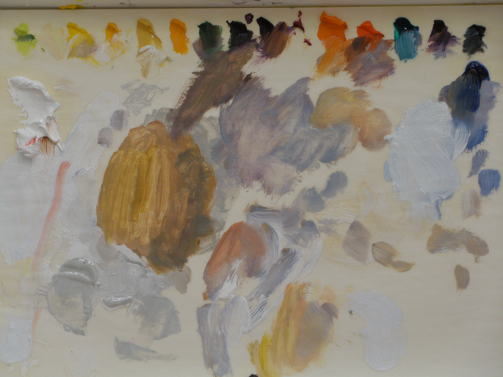
Palette shot:
Day 7/40 - rose color study #1 5x7, painted 11-16-10
This one was painted one value shape at a time, with a size 6 filbert, as I tried to construct each petal by the light shapes and shadow shapes. I started with the bottom left petal and worked out and up. Sadly, this photo doesn't show some of the more vivid colors as brightly as they turned out. I'll try to take a better photo later.
I ended up using the leftover paint from Monday's painting, here's the palette shot:
Day 6/40 - two on a vine, 5x7, painted 11-15-10
I painted this one with size 6 and size 8 filberts, which are a good deal larger than the size 1, 2, & 3 I usually use. I meant to keep things 'loose,' but it turned out about as tightly as I always paint. Oh well.
Palette shot:
Palette shot:
Day 5/40 - white on white #1, 5x7, painted 11-14-10
I'm always amazed at how many colors appear on white objects. The egg is on a white tissue, but there was still a lot of color in the shadows. Even though there's very little bright color here, this was still a lot of fun to paint. I'll do white on white again.
Palette shot:
Subscribe to:
Comments (Atom)

